Animate a Sprite Sheet With CSS steps() Without Sliding or Skipped Frames
October 12, 2026 · 7 min read
Play a sprite sheet with background-position and steps(), get the end value right, stop on the last frame, handle multi-row sheets and scale pixel art crisply.
Open the tool from this article — free, in your browser, no signup.
You have a sprite sheet and want it to play on a web page: a spinning coin, a loading character, a hover effect. You don't need a GIF or JavaScript for that. CSS does it with two pieces, background-position to pick the frame and the steps() timing function to jump from frame to frame instead of gliding. The catch is one number that is easy to get wrong, and it makes frames slide sideways or go missing.
Every snippet below was run in Chromium and checked frame by frame.
The recipe for a one-row strip
The example is an 8-frame coin, 32 × 32 pixels per frame, in a strip 256 pixels wide (coin-spin-strip.png, free to use). The element is exactly one frame big and shows the strip as its background. The animation moves the background left, one frame at a time.

<div class="coin"></div>.coin {
width: 32px;
height: 32px;
background: url(coin-spin-strip.png) 0 0 no-repeat;
animation: coin-spin 0.8s steps(8) infinite;
}
@keyframes coin-spin {
from { background-position: 0 0; }
to { background-position: -256px 0; }
}Three numbers have to agree with the sheet:
- The element is one frame: 32 × 32 pixels.
steps(8)is the number of frames. Without it the background would glide smoothly past the frames. With it, the move is cut into 8 equal jumps of 32 pixels.- The duration is frames ÷ frame rate: 8 frames at 10 frames per second = 0.8 s. How Fast Should Pixel Art Animate? helps you pick the rate.
Now look at the end value. It is −256px, the full width of the strip, not −224px, the position of the last frame. The next section shows why that matters.
Why frames slide or skip: the end-value rule
steps(8) cuts the move from the start value to the end value into 8 equal parts, and by default it shows the value at the start of each part. Sampled at the middle of each 100 ms slice, to -256px shows 0, −32, −64 and so on to −224: every frame, once each. The end value itself, an empty spot just past the strip, would only be reached at the very end of the cycle. That is exactly when the loop starts over at 0, so it never shows.
Both classic mistakes come from ending on the last frame's position instead:
| Timing | End value | What Chromium shows |
|---|---|---|
steps(8) |
−256px | 0, −32, −64 … −224: all 8 frames |
steps(8) |
−224px | 0, −28, −56 … −196: jumps of 28 px, so each frame lands 4 px further off |
steps(7) |
−224px | 0, −32 … −192: frame 8 never shows, and each frame lasts 114 ms |
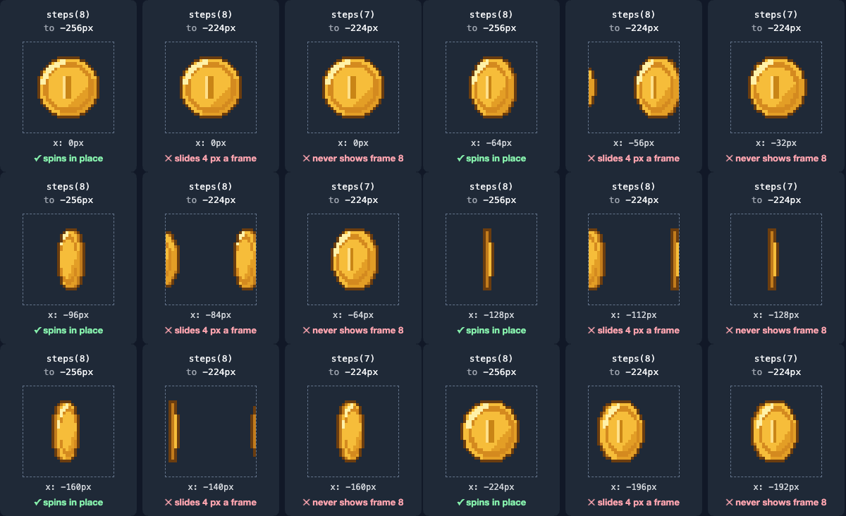
The rule: steps(N), with the end value at −(N × frame width). A sprite that drifts sideways while it plays means the end value is short. An animation that always seems to miss its last drawing means N is one too small.
jump-start, jump-end, jump-none and jump-both
steps() takes an optional second argument that says where the jumps fall (MDN's steps() reference lists four options), and steps(8) is short for steps(8, jump-end). With jump-end, the last jump happens when the cycle ends. With jump-start, the first jump happens when it begins. jump-none puts neither jump at the edges, and jump-both puts jumps at both. Here is what each one shows on the coin strip:
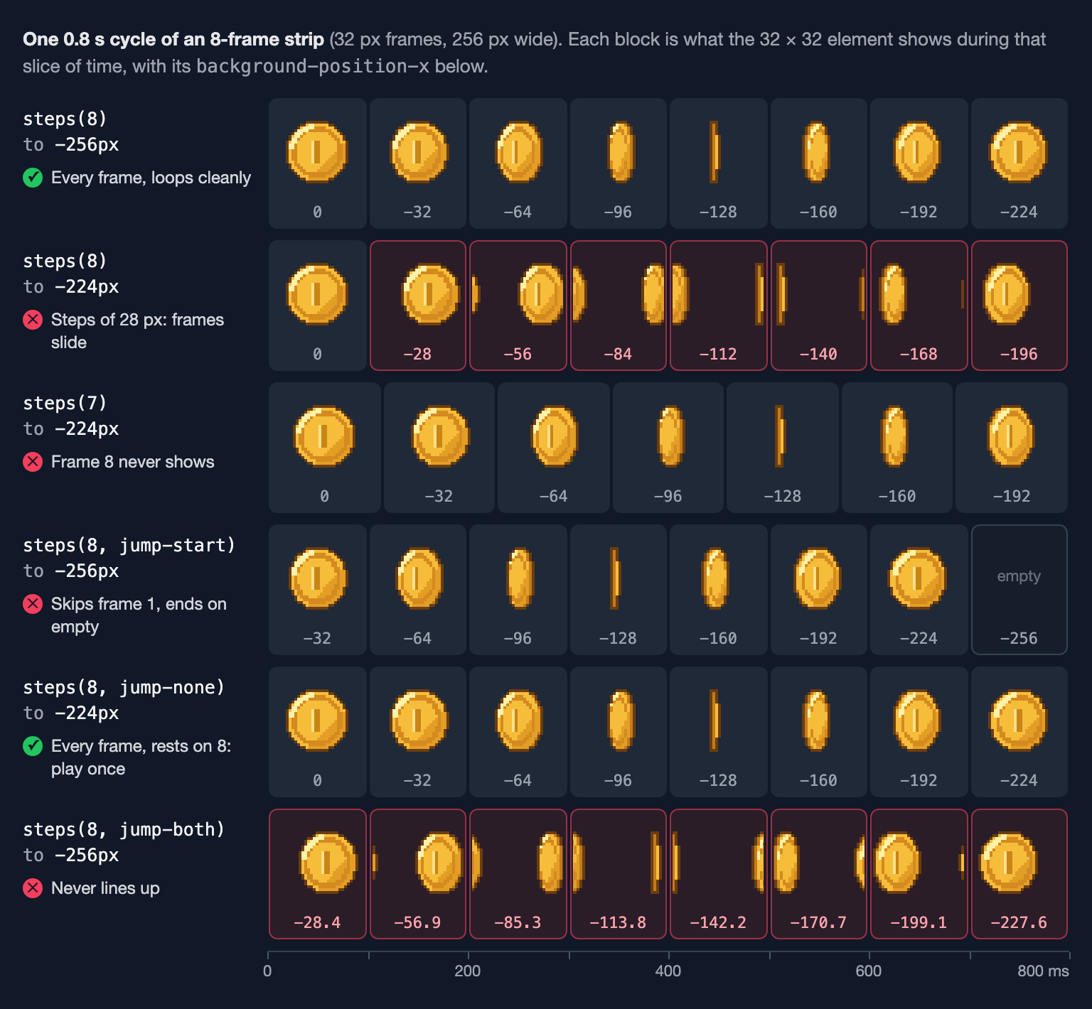
- jump-end (the default) is the one for loops.
- jump-start jumps as soon as the cycle starts, so frame 1 is skipped, and the last slice shows −256px, the empty spot past the strip. The sprite blinks out once per loop.
- jump-none makes 8 steps that include both ends: the start value and the end value each get a full slice.
- jump-both makes 8 positions 28.4 px apart (256 ÷ 9), so it never lines up with 32 px frames. It has no use for sprite sheets.
jump-none is the one for an animation that plays once and stops on its last frame, like a chest opening or a one-off burst. End on the last frame's position this time, and add forwards so the animation stays there when it finishes:
.play-once {
  width: 32px;
  height: 32px;
  background: url(coin-spin-strip.png) 0 0 no-repeat;
  animation: play-once 0.8s steps(8, jump-none) forwards;
}

@keyframes play-once {
  to { background-position: -224px 0; }
}
Do the same with the default jump-end and the animation finishes on −256px, so the sprite vanishes the moment it ends.
The jump keywords work in Chrome 77, Firefox 65 and Safari 14 and later. The older start and end spellings mean the same as jump-start and jump-end.
Sheets with more than one row
The bouncing-ball sample, ball-bounce.png, has 8 frames of 64 × 64 pixels in 4 columns and 2 rows (256 × 128 pixels). There are two ways to play it.
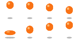
Two animations, one walking across the columns and one walking down the rows:
.ball {
  width: 64px;
  height: 64px;
  background: url(ball-bounce.png) 0 0 no-repeat;
  animation:
    ball-x 0.4s steps(4) infinite,
    ball-y 0.8s steps(2) infinite;
}

@keyframes ball-x { to { background-position-x: -256px; } }
@keyframes ball-y { to { background-position-y: -128px; } }
The column animation takes one row's worth of time (4 frames × 0.1 s) and repeats. The row animation takes the whole cycle, 0.8 s, and steps down once halfway through. The end-value rule still holds: the full width and the full height. Sampled live in Chromium, this plays frames 1 to 8 in reading order. It only works when every row is full, though. With 7 frames in a 4 × 2 grid, the empty eighth cell would flash once per loop.
One keyframe per frame works with any layout, including a half-empty last row, and it lets you time each frame separately. In a CSS animation, the timing function applies between each pair of keyframes, so steps(1) holds each keyframe's value until the next one:
.ball-hold {
  width: 64px;
  height: 64px;
  background: url(ball-bounce.png) 0 0 no-repeat;
  animation: bounce 1s steps(1) infinite;
}

@keyframes bounce {
  0%  { background-position: 0 0; }         /* held for 300 ms */
  30% { background-position: -64px 0; }
  40% { background-position: -128px 0; }
  50% { background-position: -192px 0; }
  60% { background-position: 0 -64px; }     /* the squash */
  70% { background-position: -64px -64px; }
  80% { background-position: -128px -64px; }
  90% { background-position: -192px -64px; }
}
Each percentage is the moment that frame appears. Here the ball hangs at the top for 300 ms, then every other frame gets 100 ms. Holding key poses like this is what makes an animation feel weighted instead of mechanical.
Scale it up without blur
Pixel art at 32 pixels is tiny on a modern screen. To show it 4× larger, multiply every pixel number by 4 (the element, the size of the sheet and the end value) and switch off smoothing:
.coin-4x {
  width: 128px;    /* 32 × 4 */
  height: 128px;
  background: url(coin-spin-strip.png) 0 0 / 1024px 128px no-repeat;
  image-rendering: pixelated;
  animation: coin-spin-4x 0.8s steps(8) infinite;
}

@keyframes coin-spin-4x {
  to { background-position: -1024px 0; }
}
/ 1024px 128pxin the shorthand isbackground-size: the 256 × 32 sheet drawn at 4×. The end value is the new strip width, 8 × 128 = 1024.image-rendering: pixelatedtells the browser to scale with nearest-neighbor instead of blending. In a Chromium screenshot of the first frame, the pixelated coin uses only the 7 colors drawn in the sheet. Without it, the same screenshot has 336 colors, most of them blends along the edges. It works in Chrome 41, Firefox 93, Safari 10 and later.- Use whole-number scales (2×, 3×, 4×) so every art pixel covers the same number of screen pixels. For more on this, see How to Scale Pixel Art Without Blurring It.
Pause it, and respect reduced motion
Two small rules make a looping sprite friendlier: one freezes it under the mouse, the other turns it off for visitors who have asked for less motion.
.coin:hover {
  animation-play-state: paused;
}

@media (prefers-reduced-motion: reduce) {
  .coin {
    animation: none;
  }
}
A paused CSS animation resumes from where it stopped. In the test, the hovered coin held its frame for as long as the mouse stayed on it, then carried on with the next frame when the mouse left.
prefers-reduced-motion: reduce matches when the visitor has turned on the reduce-motion setting of their operating system. macOS, iOS, Windows, Android and the main Linux desktops all have one. With animation: none, the element falls back to its own background-position, so it shows frame 1. To rest on a better pose, set a different position in the same rule, such as background-position: -64px 0 for frame 3.
Getting a strip and its positions from SpritePilot
If your sheet has several rows or gaps between frames, SpritePilot can turn it into a plain strip. Cut it into frames with Grid Slice in Sprite Detection, then open Export & Download and choose Horizontal Strip under Sprite Sheet Layout, PNG as the image format and CSS Sprites as the metadata. You get sprite-sheet.png plus sprite-sheet.css.
The CSS file isn't an animation. It holds a .sprite base class and one class per frame with that frame's position and size:
.sprite { display: inline-block; box-sizing: content-box; background-image: url('sprite-sheet.png'); background-repeat: no-repeat; background-origin: content-box; background-clip: content-box; }
.sprite-sprite_0001 { background-position: -0px -0px; width: 32px; height: 32px; }
.sprite-sprite_0002 { background-position: -32px -0px; width: 32px; height: 32px; }
That makes a good base for an animation. The first frame's class gives the element its size and its resting frame, and the animation does the rest:
<div class="sprite sprite-sprite_0001 coin"></div>.coin { animation: coin-spin 0.8s steps(8) infinite; }
@keyframes coin-spin { to { background-position: -256px 0; } }While the animation runs, it overrides the class's background-position; with reduced motion on, the class shows frame 1. Leave Trim transparency off for animation frames: trimmed frames are centered in their cells, so any sprite that isn't symmetrical shifts from frame to frame. To find the right speed before you write it into the duration, play the sheet in the Sprite Player and move its speed slider anywhere from 1 to 60 fps. Grid Slice, Export & Download and the Sprite Player all run in your browser; nothing is uploaded.
A checklist
- The element is one frame: width and height of a single frame.
steps(N), where N is the number of frames in the row.- End value = −(N × frame width): the full strip, not the last frame.
- Duration = N ÷ frames per second.
- Play once and stop:
steps(N, jump-none), end on the last frame, addforwards. - Several rows: two animations if every row is full, otherwise one keyframe per frame with
steps(1). - Bigger: multiply every number by a whole-number scale and add
image-rendering: pixelated. - Add a
prefers-reduced-motionrule that turns the animation off.