Limited Color Palettes for Pixel Art: Why They Help and How to Pick One
October 14, 2026 · 7 min read
Why a small palette makes pixel art read better, how to build hue-shifted color ramps, check them in grayscale, and start from palettes like DB32.
Open the tool from this article — free, in your browser, no signup.
Pick every color from a full color picker and your sprites slowly drift apart: three slightly different browns for wood, shadows that turn muddy, a highlight that matches nothing else on screen. A limited palette — a fixed set of 16 or 32 colors you draw everything with — stops that before it starts. Here's why the limit helps, how to build color ramps that shade well, how to check them, and where to find a good palette to start from.
Why a small palette makes better pixel art
A palette isn't a restriction you put up with. It does three jobs for you:
- Consistency. Every sprite drawn from the same palette shares the same skin tones, the same shadow color and the same highlight. Characters drawn weeks apart, or by different people, still look like one game.
- Readability. A 32 × 32 sprite is read by its shapes, and shapes come from clear steps between colors. Ten nearly identical reds don't add detail at that size; they make edges soft and look like noise.
- Speed. Shading becomes "pick the next darker swatch" instead of nudging three sliders until something looks right.
Some platforms make the limit part of their identity. The PICO-8 fantasy console's official manual gives it a fixed palette of 16 colors, a limit its games are designed around.
How many colors do you need? A well-built palette of 16 to 32 colors can cover a game's characters, tiles and interface. A single sprite uses far fewer: the coin in this article uses 8.
Ramps: the part of a palette you actually shade with
A ramp is a run of colors for one material, from its deepest shadow to its brightest highlight. Shading a sprite means moving up and down a ramp: the side facing the light gets the lighter steps, the side facing away gets the darker ones, and the outline is often the darkest step of all.
Good palettes are built out of ramps, even when they don't look like it. Here is DawnBringer's 32-color palette, DB32, which SpritePilot's Pixel Art Editor loads by default:
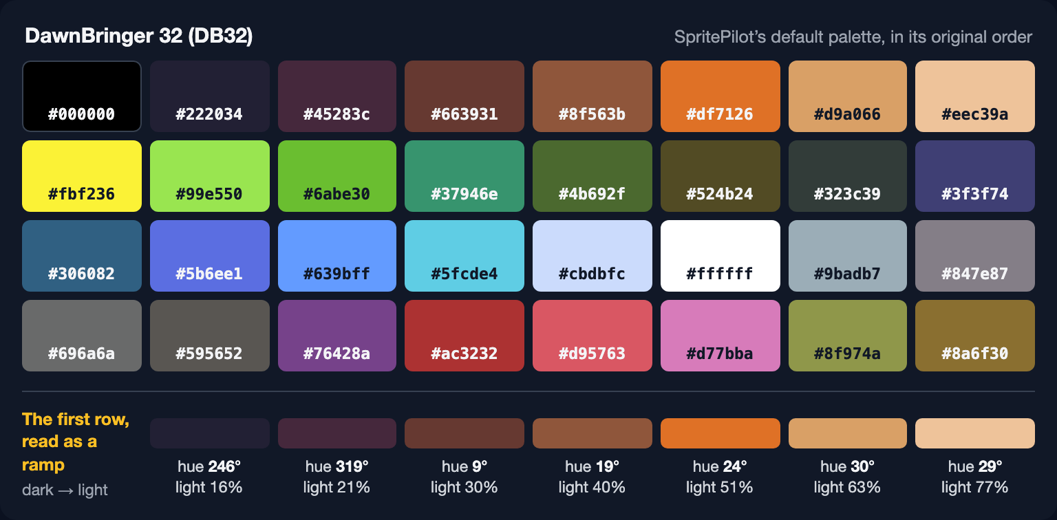
Read the first row from left to right and it works as a ramp for skin, wood or earth. The interesting part is the hue: the darkest steps aren't dark orange, they are dark blue-violet and plum. That isn't a quirk; it's a technique called hue shifting.
The full palette, ready to paste into any editor:
#000000 #222034 #45283c #663931 #8f563b #df7126 #d9a066 #eec39a
#fbf236 #99e550 #6abe30 #37946e #4b692f #524b24 #323c39 #3f3f74
#306082 #5b6ee1 #639bff #5fcde4 #cbdbfc #ffffff #9badb7 #847e87
#696a6a #595652 #76428a #ac3232 #d95763 #d77bba #8f974a #8a6f30
Hue shifting: shadows aren't just darker
The obvious way to build a ramp is to keep one hue and change only the lightness. It works, but it tends to look flat and a little muddy. The usual alternative is hue shifting: as a color gets darker, rotate its hue toward blue or purple; as it gets lighter, rotate it toward yellow.
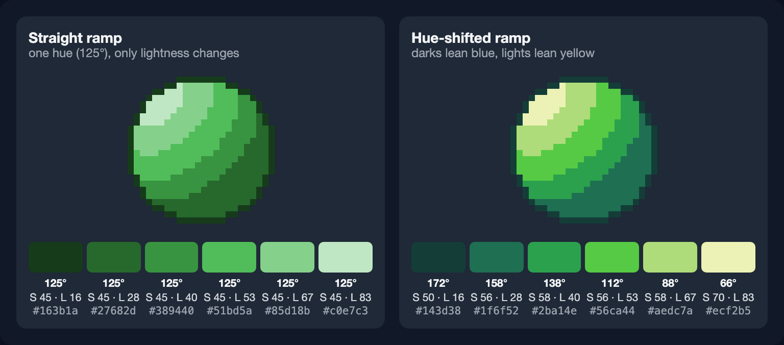
The left sphere is fine; the right one looks lit. Its shadows lean toward teal, as if they were filled with cool light from the sky, and its highlights lean toward a warm yellow, like sunlight.
There's no fixed amount to shift. The coin's gold moves only 20° from outline to highlight (30° to 50°); the green ramp above moves about 20° per step; DB32's first row swings more than 100° across its three darkest steps. Small shifts read as a richer version of one color; large ones read as a deliberate stylistic choice. Both are fine; a ramp whose hue jumps around without a direction is not.
Check the values with a grayscale copy
Hue and saturation give a sprite its character, but value — how light or dark each color is — is what makes it readable. The quickest check is to look at it in grayscale: each step of a ramp should be clearly lighter than the one before it, and the outline, shadow, base and highlight should stay apart.
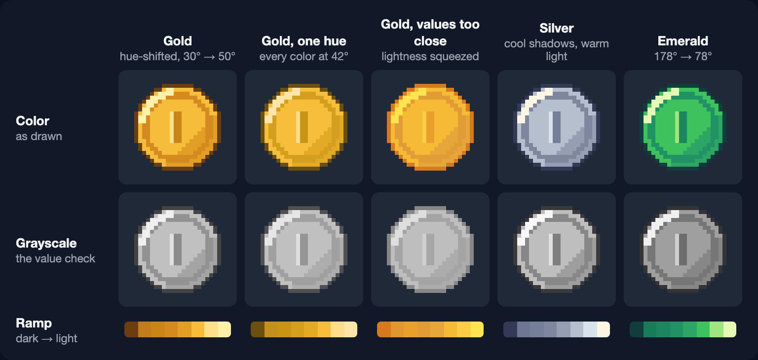
Two things stand out:
- "Gold, one hue" keeps the original's lightness, so its grayscale copy is nearly identical. In color, though, its dark steps turn olive and the coin looks duller. Hue shifting is about richness, not readability.
- "Gold, values too close" looks acceptable in color, because the hues still differ. In grayscale the outline, rim and face merge, and that is how it will read at small sizes and on a busy background.
Any editor can desaturate a copy of your sprite. In a browser, add filter: grayscale(1) to the image in the developer tools; it's what made the grayscale row above, and MDN documents the function. Also look at the sprite at its real size, 1×, on the background it will appear on.
Palettes worth starting from
You don't have to invent a palette to get these benefits. Three well-known starting points:
- DB32 — the 32 colors above, by the pixel artist DawnBringer. Wide enough for a whole game, and built from ramps.
- DB16 — DawnBringer's 16-color palette, for when 32 colors are more than you need.
- PICO-8 — 16 fixed colors, listed in the manual by name, from black and dark blue to pink and peach. A good exercise in doing a lot with a little.
Lospec's palette list is a database of pixel-art palettes that you can filter by number of colors, and it offers each palette as a PNG image, which is exactly what the import below needs.
Build your own ramp
When no palette fits, build ramps one material at a time:
- Pick the base color, the one most of the material will be. For the coin that's the face,
#f6bd3a. - Add two or three darker steps and one or two lighter ones. Space them evenly in lightness; the green ramps above step 12 to 16 points of HSL lightness at a time.
- Rotate the hue a little at every step — toward blue or purple going darker, toward yellow going lighter.
- Check it in grayscale. Fix any step that merges with its neighbor before you shade anything with it.
- Share colors between ramps. One dark purple can outline the wood, the leaves and the stone, which keeps the whole palette small.
Most materials need 3 to 6 steps. A sprite with a single material, like the coin, can afford a longer ramp: its gold has 8.
Import a palette into SpritePilot's Pixel Art Editor
In the Pixel Art Editor, the palette panel shows DB32 until you click Import and choose an image. What happens next matters for picking the right image:
- The editor reads the image's pixels as they are, with no blending, and skips pixels that are more than half transparent.
- It counts how often each exact color appears and keeps the 32 most used, most used first. Colors used equally keep the order in which they first appear: left to right, top to bottom.
- Images bigger than 512 px on their longest side are reduced first (again without blending), so small palette images are read pixel for pixel.
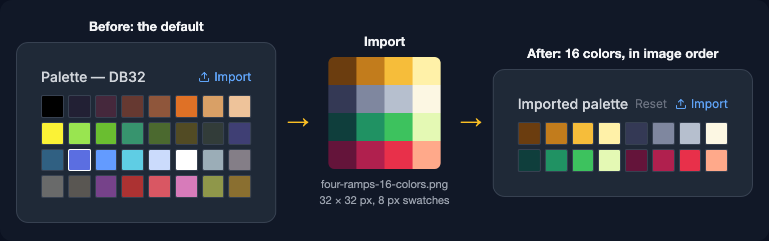
So the best source is a palette image with one swatch per color, all the same size — such as a palette downloaded as a PNG, or this 16-color example with the gold, silver, emerald and ruby ramps used in these articles (free to use). A photo or an anti-aliased painting is a poor source: it has thousands of slightly different colors, and the 32 most common are usually near-duplicates from its largest areas.

The import changes the swatches you pick from, not what you've already drawn. Reset brings DB32 back, and the editor remembers your palette in this browser for next time. You can also type any hex value into the Color field next to the color picker.
In short
- Draw from a fixed palette: 16 to 32 colors for a game, 3 to 6 steps per material.
- Build ramps that rotate the hue — toward blue or purple in the shadows, toward yellow in the light.
- Check every ramp in grayscale; value is what makes a small sprite readable.
- Start from DB32, DB16 or PICO-8 if you don't want to build your own.
- To use a palette in SpritePilot, import an image with one equal-sized swatch per color; it reads up to 32 colors.
Want to see a ramp in motion? The free animated pickup sprites use three hue-shifted ramps — gold, blue and red — and list every color they use.